Interview with Gustavo Eandi by Jeff Jank.
The cover for Sofie’s SOS Tape was done by Gustavo Eandi, an Argentinan-based artist who I’ve worked with for six years but have never met in person. We worked first, and many times later, on Madlib records (MMS #1: Before the Verdict and others). Later he did J Rocc’s Some Cold Rock Stuf, and a series of dub records: Signs & Wonders, Bubble Dub, and Meaning of Dub. He also did one of my favorite obscure Stones Throw covers, Dave Dub’s The Treatment. For that album I asked him, “do whatever you like as long as it’s in pencil, just don’t show me until you’re finished.”
I count about 10 Gustavo sleeves on the Stones Throw Covers poster.
The first thing I like about working with Gustavo is that his artwork is compelling and unpredictable. I can’t guess when he’ll be drawing or doing something that looks like it came from a 30-year old Xerox.
The second thing I like about working with Gustavo is that he’s fast. However, the process for Sofie’s SOS Tape was anything but fast – it took about many months. With the album’s release, I thought I’d take the opportunity to ask him what the hell was up with that.
JJ: Gustavo, what the hell was up with that?
Gustavo: The process for this artwork was complex and long, well, not too long compared with Some Cold Rock Stuf, but long. Pleasurable too.
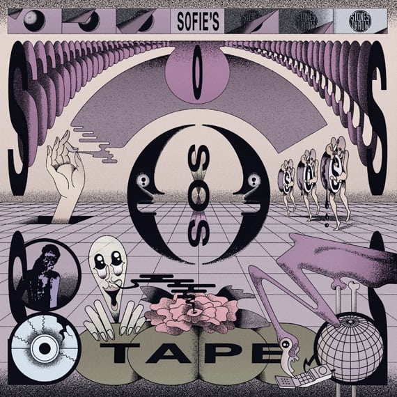
I forgot that Cold Rock Stuf also took a long time – they all seem so easy when they're finished. What was the process for Sofie’s SOS Tape? Tell me about the inspiration for this freaky Russian Yellow Submarine style?
Sofie sent me references from Tadanori Yokoo, and some Japanese posters from the 60s. I started with that. Then, some xerox stuff from the 80/90s, and the things I mostly do for her DJ sets or when she was in Boiler Room. Because I'm a big fan of 60s Japanese graphic design – Tadanori and Keiichi Tanaami mainly – I was happy with the path she proposed.
Then I worked on the palette and tried to find balance and symmetry in the composition – there’s a lot of characters in scene. But because I'm not Japanese, as you may know, maybe that is why this looks like a Russian bootleg – a South-American illustrator with poor skills trying to do Japanese stuff.
When I was a kid I hated the Yellow Submarine artwork, the movie too. (I was more a Pink Floyd's The Wall boy … and now I'm not a Pink Floyd man, if you ask.) But I like if this looks like a pirate version of Yellow Submarine. Thanks.
Some early versions were heavy on the photocopy-based art.
The xerox aesthetic was rejected, by you. But I kept some of that atmosphere in the grain and the dirtiness of the characters. The most evident is the girl, Sofie-inspired, on the back cover, a kind of low-sci-fi Eve, without Adam.
The purple color in the whole album is am homage to Prince, who died in the middle of the process. RIP Prince.
Why a flamingo? What's up with the three bass drum dudes?
Most of the images and the characters are taken from old magazines – old German photo mags, National Geographic mags, UFO’s, Argentinian paparazzi mags, etc. – that I cut out and scanned. They are part of a big archive on my hard disk. The flamingo is taken from there too. The three bass drum dudes are taken from here, Pieter van der Heyden, after Pieter Brueghel, “The Fall of the Magician Hermogenes.”
Gustavo Eandi website | Instagram | Twitter

![]()
Sofie's SOS Tape: three early sketches, final art before color, and back cover.
![]()


